All projectsAllegion / Overtur
See the result as you build it.
Overtur is where teams work out door security and openings together.
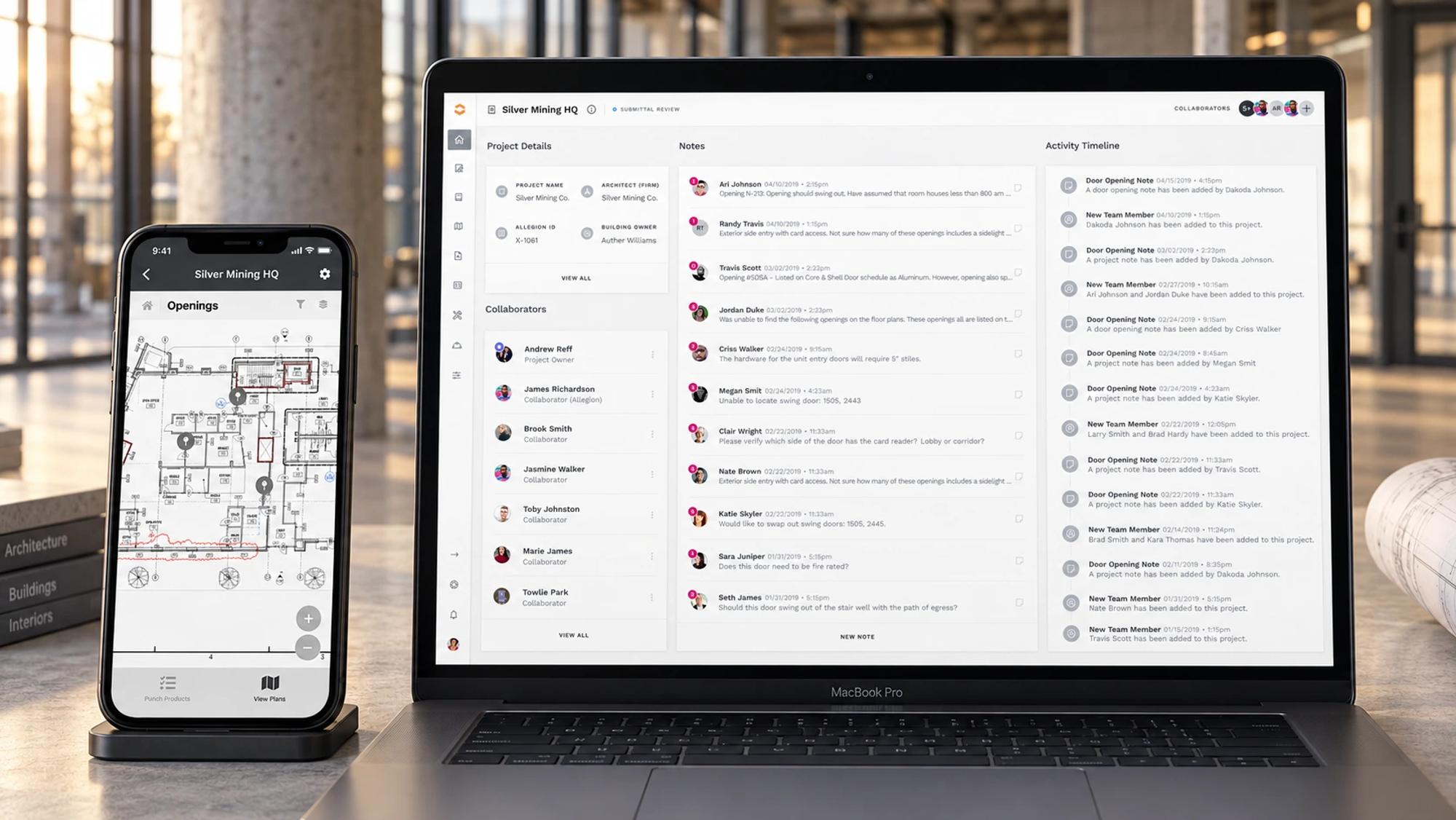
Popular, and hard to get around.
Overtur had become popular because nothing else in the industry did what it did. Success brought problems: no visual consistency, weak navigation, and illogical paths. Users felt trapped at times, clicking and searching far more than they should.
Heuristics, councils and power users.
I ran a heuristic analysis to find what users loved and what needed work, a competitive analysis, and interviews with user groups and user councils (real community councils in the Overtur ecosystem). The aim: simpler navigation, important information up front, clean but not cluttered.
- Heuristic analysis of the existing application
- Interviews with user councils and power users
- Navigation redesigned for space and clarity
- A dashboard showing project status at a glance
- Notes and mentions for team collaboration
- A report builder with live preview
- Built with Project Phoenix components
Keep the project in view.
The application had grown without a unified design vision. Navigation hid important information, and users couldn’t jump between projects, so they opened multiple browser tabs, which slowed everything down.
Streamlined navigation freed the screen for actual work. The dashboard shows the projects a user belongs to, is invited to, and has completed. Notes and mentions brought collaboration into the product. The report builder turned what was once a multi-step wizard into an editor with live preview.
What expert users said.
The product was reshaped with its daily users at the table, and the report builder, from a wizard to a live editor, is the change they felt most. What follows is what shipped and what they told us.
What shipped
Streamlined navigation that frees the screen for the work; a dashboard of the projects you belong to, were invited to and have completed; notes and mentions for the team; and a report builder that went from a multi-step wizard to an editor with a live preview.
What was observed
The redesign was tested daily with expert users and user councils. Some users resisted the change at first; the overwhelming response was excitement, and users said their daily work became more efficient.
What this case doesn’t claim
Figures. The original case study described the direction of change without a published baseline or method, so it is given here as what people reported, not as a measurement.
Patterns that outlasted the refresh.
The patterns set during this refresh became templates for new features, so the platform could stay consistent as it grew.
The principle I carry forward
Show people the result while they’re making it. Feedback belongs where the work happens.