All projectsAllegion / Access Management
The clever idea wasn’t the right one.
Administrators use this portal every day to add people to Allegion’s applications, and the list of applications kept growing.
Administrators couldn’t see their own users.
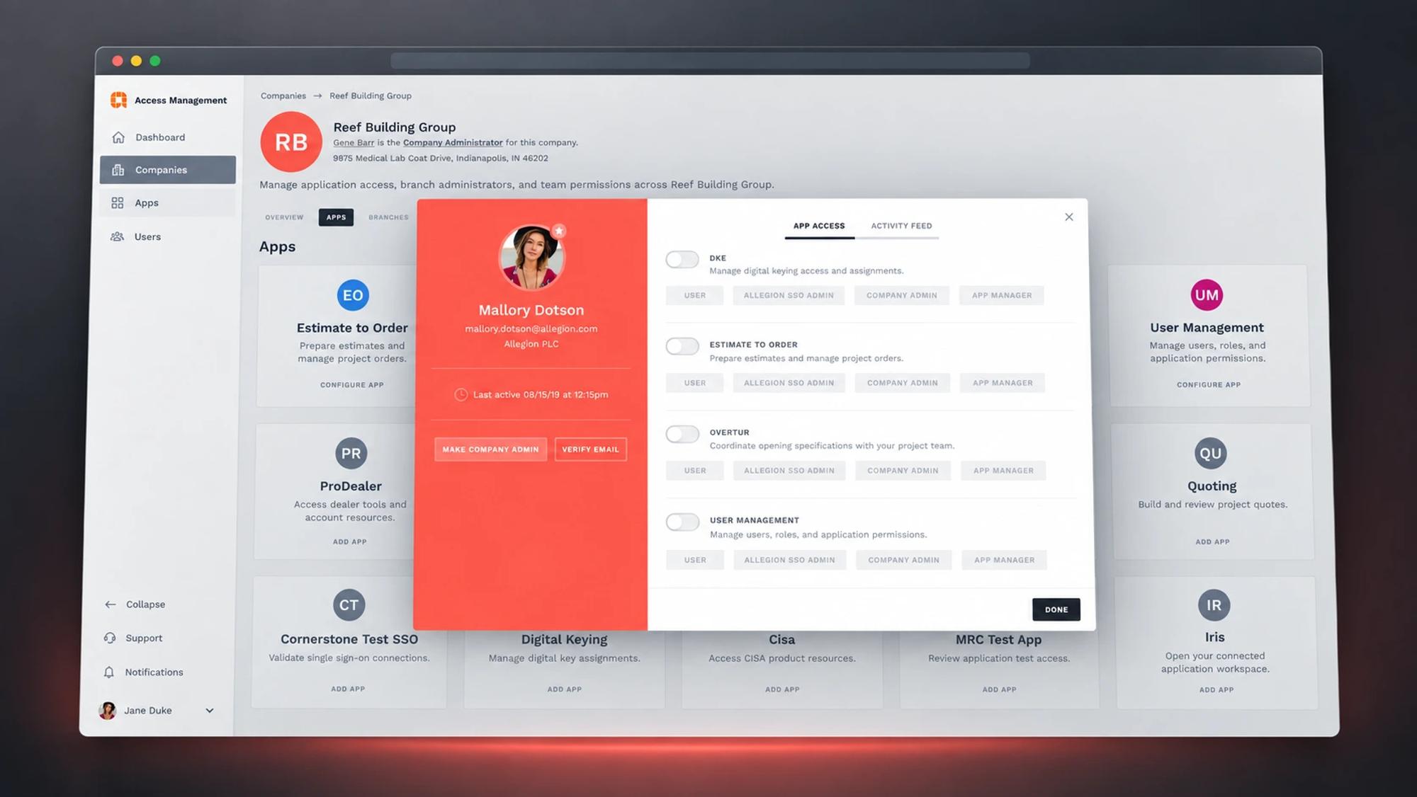
The Access Management portal, used daily by Allegion and company administrators to add users to applications, was outdated. As the number of applications grew, it got harder to manage. Administrators couldn’t see their actual user base or what needed doing.
A tree panel, tested and set aside.
I researched the user management space, then focused on making administration “super simple.” I explored progressive disclosure with a tree-panel concept, but user testing raised concerns about screen real estate. Surveys showed users wanted persistent navigation that says where they are. That led to side navigation with breadcrumbs.
- User interviews and surveys on navigation preferences
- A dashboard with immediate visibility into user status
- A user card format for quick actions
- Side navigation with breadcrumb support
- Quick switching between companies, users and applications
- A testbed for the Project Phoenix design system
The tree panel lost to persistent navigation.
Simple tasks were unnecessarily complex. There was no clear view of user status, pending invitations or application usage, and every new application made it worse.
The portal opens on a dashboard. Administrators see unvalidated users, resend invitations and view analytics at a glance. Card views make quick actions and switching context easy.
Visibility, and a proving ground for Phoenix.
The biggest feedback was visibility. A dashboard showing unvalidated users, invitation status and new versus returning users changed the daily workflow. The project also proved Project Phoenix in a real application.
What shipped
A dashboard that shows the state of the user base at a glance (unvalidated users, invitation status, new and returning users); user cards for quick actions; side navigation with breadcrumbs; and quick switching between companies, users and applications.
What was observed
The biggest feedback from administrators was the immediate visibility they gained. The project was also the first real test of the Phoenix design system.
What this case doesn’t claim
Figures. The original case study described the direction of change without a published baseline or method, so it is given here as what people reported, not as a measurement.
What fed back into the system.
What the project validated fed back into the design system and into other enterprise products.
The principle I carry forward
A clever idea is only right if the people using it agree. Test before you fall in love.